National Yield Comparison
Source:vignettes/national-yield-comparison.Rmd
national-yield-comparison.RmdHow do corn yields at the Morrow Plots compare to the national average?
This exercise demonstrates how to use ggplot2 to create a graph comparing corn yields on the Morrow Plots to the U.S. national average. We’ll use the data from the morrowplots R package, and we’ll also import national average data from the National Agricultural Statistics Service (NASS).
In addition to the morrowplots package, this exercise also uses the dplyr and ggplot2 packages.
1. Visualize the Morrow Plots data
First, let’s take a look at the Morrow Plots data so you can see what we’re working with.
head(morrowplots)
#> # A tibble: 6 × 26
#>   phase  year plot  plot_num plot_dir rotation corn  crop  variety      all_corn
#>   <dbl> <dbl> <chr>    <dbl> <chr>       <dbl> <lgl> <chr> <chr>        <lgl>
#> 1     1  1888 3NA          3 NW              1 TRUE  CC    Burr's White FALSE
#> 2     1  1888 3NB          3 NW              1 TRUE  CC    Burr's White FALSE
#> 3     1  1888 3NC          3 NE              1 TRUE  CC    Burr's White FALSE
#> 4     1  1888 3ND          3 NE              1 TRUE  CC    Burr's White FALSE
#> 5     1  1888 3SA          3 SW              1 TRUE  CC    Burr's White FALSE
#> 6     1  1888 3SB          3 SW              1 TRUE  CC    Burr's White FALSE
#> # ℹ 16 more variables: yield_bush <dbl>, yield_ton <dbl>, treated <lgl>,
#> #   treatment <chr>, manure <dbl>, lime <dbl>, nit <dbl>, p205 <dbl>,
#> #   k20 <dbl>, stover <dbl>, population <dbl>, plant_date <chr>,
#> #   plant_day <dbl>, soil_sample <lgl>, damage <chr>, notes <chr>
1.1 Import and subset the Morrow Plots data
We’ll be visualizing the corn yield data in the ‘yield_bush’ variable, but before we can compare corn yields, we need to narrow down the dataset. Plots 4 and 5 grow corn every 2 to 3 years, but plot 3 grows corn every year. For the purposes of this exercise, we’ll create a new subset of data from plot 3 only, but you could repeat these steps with Plots 4 and 5.
We also have a few years where ‘yield_bush’ data is missing and marked with ‘NA’. We can filter those out too so they don’t show up in our visualizations.
If you look at the Morrow Plots data, you’ll see that each plot has multiple rows of data for each year. That’s because each plot has subplots. Some subplots receive fertility treatments and some don’t. This is recorded in the TRUE/FALSE ‘treated’ variable. For our purposes, we want the annual average yield, and because treatments affect yield, we’ll calculate two annual averages - one for treated subplots and one for untreated subplots. None of the subplots received treatments from 1888 to 1903, so those years will only have one average for untreated subplots.
## name the new dataset mp3 for plot 3
mp3 <-

  ## filter to only include rows where 'plot_num' is 3 and 'yield_bush' is not 'NA'
  dplyr::filter(morrowplots, plot_num == 3, !is.na(yield_bush))  %>%

  ## condense the filtered data and group it first by 'year' and then by 'treated'
  dplyr::group_by(year, treated) %>%

  ## calculate the average 'yield_bush' for each grouping
  ## and put that average in a new field called 'mp_ave'
  dplyr::summarise(mp_ave = mean(yield_bush))
#> `summarise()` has grouped output by 'year'. You can override using the
#> `.groups` argument.

head(mp3)
#> # A tibble: 6 × 3
#> # Groups:   year [6]
#>    year treated mp_ave
#>   <dbl> <lgl>    <dbl>
#> 1  1888 FALSE     54.3
#> 2  1889 FALSE     43.2
#> 3  1890 FALSE     48.7
#> 4  1891 FALSE     28.6
#> 5  1892 FALSE     33.1
#> 6  1893 FALSE     21.7
1.2 Create a line graph for plot 3
Now you should have a dataset called ‘mp3’ in your R environment, which contains annual averages for treated and untreated corn in plot 3.
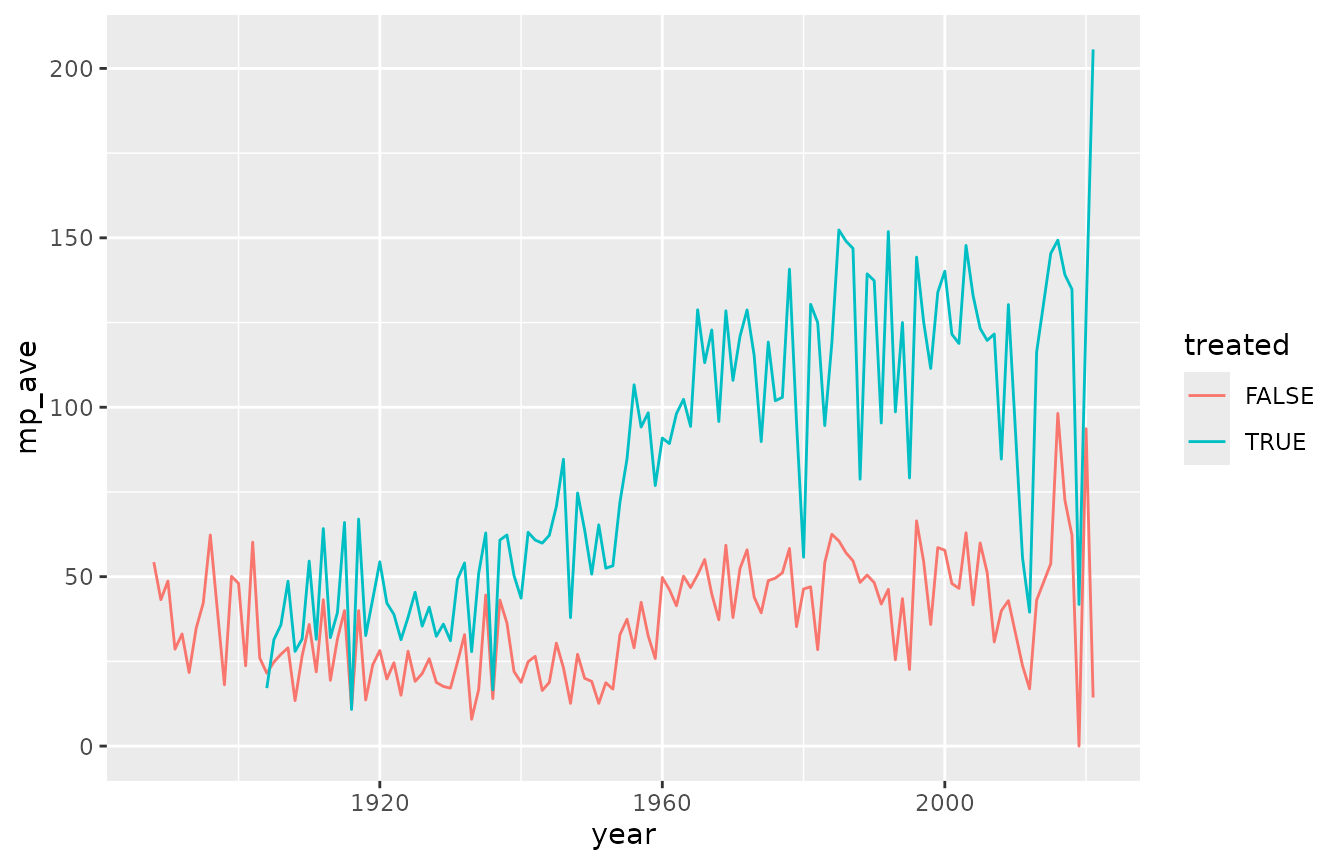
We can visualize the plot 3 yields in a line graph with ‘year’ on the x axis and ‘mp_ave’ on the y axis. We’ll use the ‘treated’ variable to plot treated and untreated corn with different colors.
ggplot2::ggplot(data = mp3) +
  ggplot2::geom_line(ggplot2::aes(x= year, y = mp_ave, color = treated))
1.3 Smooth out the line graph
Those lines are all over the place! So much so that it’s kind of hard to read.
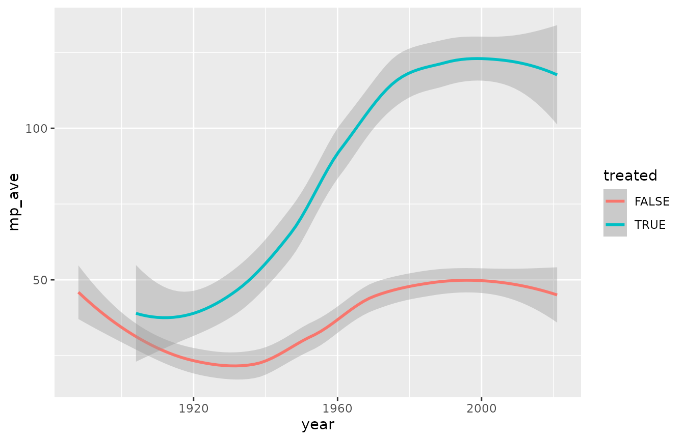
Try the same parameters with geom_smooth() instead, which creates trend lines that makes it easier to view long-term trends in varied data.
ggplot2::ggplot(data = mp3) +
  ggplot2::geom_smooth(ggplot2::aes(x= year, y = mp_ave, color = treated))
#> `geom_smooth()` using method = 'loess' and formula = 'y ~ x'
Much smoother! Notice how the axes of the two graphs differ. R automatically adjusts axes, so keep that in mind when comparing graphs.
Now that we know what the corn yield trends from plot 3 look like, we can add in national averages for comparison.
2. Get yield data from NASS
For this exercise, we’re using data downloaded from the NASS website. (Alternatively, you could use the NASS API to import data directly into R, but that requires registration. For our purposes, working from a file is easier.)
2.1 Combine NASS and mp3 data (choose 1 option)
You have two options for NASS data. You can either use this as an opportunity to learn how to use NASS and download the data yourself, or you can use the copy that’s saved in the morrowplots GitHub repository.
Option 1: Download NASS data yourself
To download the NASS data, go to the NASS Quick Stats webpage and follow the steps in the video below.
NASS will give your file a super long name, so rename it “NASS_data.csv” instead. Then you can import it into need to make sure R knows where to find it, which you can do in one of two ways:
You can move the NASS file to your working directory. In your R console, use getwd() to identify your working directory and then manually move the file to that folder. In the code below, replace the URL with your file name.
Or, you can add a file path to read.csv() to tell R where the file is. In your R console, use file.choose(), which will pull up a window that will let you navigate to your NASS file. R will print your file path, which you can then add to the read.csv() code below. For guidance, see this step-by-step example.
Option 2: Get NASS data from GitHub
If you feel like you already have plenty of work to do and don’t want to learn how to use NASS, that’s ok. You can use the copy of the NASS data that’s in the morrowplots GitHub repository.
## If you chose Option 1: Download NASS data yourself, replace the URL with your file name, and path if necessary
NASS <- read.csv("https://github.com/SandiCal/morrowplots/raw/main/vignettes/NASS_data.csv")
2.2 Combine NASS and mp3 data
The NASS data contains a whole bunch of stuff we don’t need, so first we’ll pare it down to just ‘Year’ and ‘Value’. While we’re doing that, we’ll also rename the NASS variables. We’ll change ‘Year’ to ‘year’ so it matches the variable in mp3 exactly (we need that for the next step), and we’ll change ‘Value’ to ‘nat_ave’ for national average.
Once NASS is pared down, we’ll add the ‘nat_ave’ variable to the mp3 dataset and match the data up by ‘year’.
## remove everything from NASS except 'Year' and 'Value'
NASS <- dplyr::select(NASS, year = Year, nat_ave = Value)

## join mp3 and NASS data by 'year'
mp3_NASS <-
  mp3 %>%
  dplyr::left_join(NASS, by = "year")

head(mp3_NASS)
#> # A tibble: 6 × 4
#> # Groups:   year [6]
#>    year treated mp_ave nat_ave
#>   <dbl> <lgl>    <dbl>   <dbl>
#> 1  1888 FALSE     54.3    29.1
#> 2  1889 FALSE     43.2    29.5
#> 3  1890 FALSE     48.7    22.1
#> 4  1891 FALSE     28.6    29.6
#> 5  1892 FALSE     33.1    24.7
#> 6  1893 FALSE     21.7    23.8
3. Add national data to the Morrow Plots graph
You should now have NASS and mp3_NASS datasets in your R environment.
3.1 Plotting the combined data
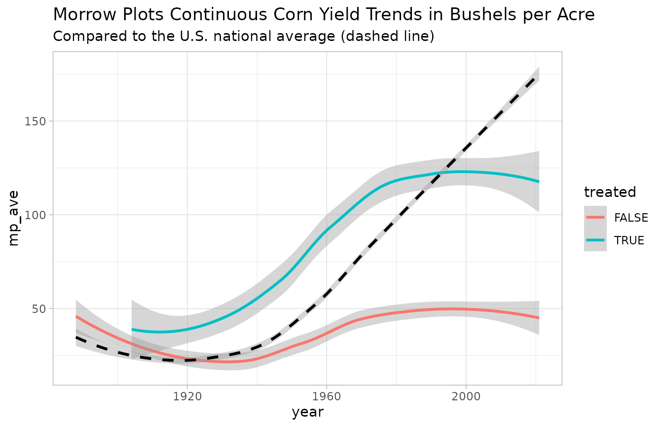
We can now recreate our geom_smooth graph from above using the mp3_NASS data, and add a black dashed line to show the national average.
Since this is our final graph, we can also add a title and subtitle to provide context, and a built-in theme to change the look of the graph.
ggplot2::ggplot(data = mp3_NASS) +

  ## mp_ave color coded by 'treated'
  ggplot2::geom_smooth(ggplot2::aes(x= year, y = mp_ave, color = treated))+

  ## add nat_ave as a dashed black line in the same graph
  ggplot2::geom_smooth(ggplot2::aes(x= year, y = nat_ave), linetype = "dashed", color = "black")+

  ## add title and subtitle
  ggplot2::labs(title = "Morrow Plots Continuous Corn Yield Trends in Bushels per Acre",
       subtitle = "Compared to the U.S. national average (dashed line)"
       )+

  ## add one of the built-in themes
  ggplot2::theme_light()
#> `geom_smooth()` using method = 'loess' and formula = 'y ~ x'
#> `geom_smooth()` using method = 'loess' and formula = 'y ~ x'
3.2 Interpreting the Results
Now that you have a combined graph, how do the data compare?
The untreated continuous corn (that’s where corn is grown every single year with no fertility treatments) starts out performing slightly better than the national average, but begins to dip over time as the untreated soil is depleted. Even so, Illinois soil is so rich that the untreated corn is pretty similar to the national average until the late 1930’s when the national average starts to rise up and break away. Why is that? One reason is that around that time, hybrid corn was introduced, and it performed better than previously popular corn breeds. Hybrid corn was introduced into the Morrow Plots in 1937, which is one reason why we see both the treated and untreated yields start to rise after that.
The treated continuous corn rises a lot higher than the untreated yields, but why does it eventually plateau while the national average keeps rising? One reason is the other major variable in the Morrow Plots experiment - crop rotation. Planting corn year after year eventually depletes the soil, even when the soil is treated. This graph only includes data from continuous corn. If you repeat these steps with corn yields from Plot 4 or 5, both of which rotate corn with other crops, you’d see that those plots perform better over the long term.
You did it! You combined datasets and graphs, plus you bothered to read through the interpretation, which proves you really care about data. Well done!